Perté
Perté
Perté
Perté represents a re-imagined and luxurious iteration of the classic Pert Plus brand, offering discerning consumers a premium hair care experience that embodies sophistication, exclusivity, and superior quality. Here's a summary of the product scope:
Perté represents a re-imagined and luxurious iteration of the classic Pert Plus brand, offering discerning consumers a premium hair care experience that embodies sophistication, exclusivity, and superior quality. Here's a summary of the product scope:
Perté represents a re-imagined and luxurious iteration of the classic Pert Plus brand, offering discerning consumers a premium hair care experience that embodies sophistication, exclusivity, and superior quality. Here's a summary of the product scope:
DELIVERABLES
logo
packaging
Product Design
Product Video
Social Media
Year
2020
Roles
Branding
Packaging
video

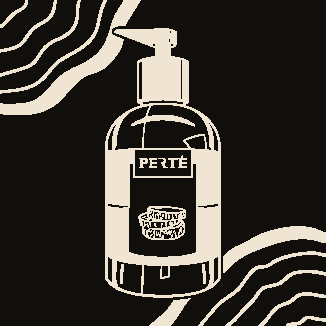
For Perté, I crafted a label that embodies quiet luxury — minimal, moody, and emotionally rich. Using a dark palette paired with grayscale photography, the design leans into elegance without excess. Soft serif typography and spacious layout choices reflect the brand’s high-end positioning. The result? A visual identity that doesn’t scream luxury — it whispers it.
For Perté, I crafted a label that embodies quiet luxury — minimal, moody, and emotionally rich. Using a dark palette paired with grayscale photography, the design leans into elegance without excess. Soft serif typography and spacious layout choices reflect the brand’s high-end positioning. The result? A visual identity that doesn’t scream luxury — it whispers it.
For Perté, I crafted a label that embodies quiet luxury — minimal, moody, and emotionally rich. Using a dark palette paired with grayscale photography, the design leans into elegance without excess. Soft serif typography and spacious layout choices reflect the brand’s high-end positioning. The result? A visual identity that doesn’t scream luxury — it whispers it.
I produced a 30-second promotional video for Pertè, crafted to feel elegant and high-end. Through refined visuals, a polished voice-over, and subtle sound design, the spot highlights the brand’s sophistication and premium character.
I produced a 30-second promotional video for Pertè, crafted to feel elegant and high-end. Through refined visuals, a polished voice-over, and subtle sound design, the spot highlights the brand’s sophistication and premium character.
I produced a 30-second promotional video for Pertè, crafted to feel elegant and high-end. Through refined visuals, a polished voice-over, and subtle sound design, the spot highlights the brand’s sophistication and premium character.
I created a dynamic promo video for Pertè, featuring 3D animation of the bottle falling from the sky. The cinematic drop emphasized luxury and impact, highlighting the product's elegance and premium feel.
I created a dynamic promo video for Pertè, featuring 3D animation of the bottle falling from the sky. The cinematic drop emphasized luxury and impact, highlighting the product's elegance and premium feel.
I created a dynamic promo video for Pertè, featuring 3D animation of the bottle falling from the sky. The cinematic drop emphasized luxury and impact, highlighting the product's elegance and premium feel.
3D251E
110F0B
F0E5D3
FFFCF8
3D251E
110F0B
F0E5D3
FFFCF8
3D251E
110F0B
F0E5D3
FFFCF8